Contents

Part 1: Exposure

  1. 1 Mastering the Exposure TriangleBalance aperture, shutter speed and ISO for brightness, depth, motion and noise.
  2. 2 ISO and image noiseWhen to raise ISO, why grain appears, and how to trade it for a faster shutter.
  3. 3 MeteringWhat the meter aims for, how to read it, the four metering modes, and Sunny 16 when there's no meter.
  4. 4 Shooting modes and the histogramLet the camera set one setting, steer it with exposure compensation, and check the result with the histogram and zebras.
  5. 5 Dynamic rangeHow many stops a camera can hold at once, what to keep when a scene is wider, and measured figures for real cameras.
  6. 6 Shutter speed and motionCamera shake, freezing or blurring a moving subject, and ND filters for long exposures.
  7. Part 1 cheat sheetFormulas and starting settings from chapters 1–6.
  8. Part 1 quizCheck yourself on chapters 1–6.

Part 2: Focus and depth

  1. 7 Camera LensLens anatomy and how to choose wide, standard, telephoto, prime, zoom and specialist lenses for real subjects.
  2. 8 Aperture and depth of fieldWhy a wider aperture blurs the background, what else controls blur, and the shape of bokeh.
  3. 9 Sensor size and crop factorWhat a smaller sensor crops, equivalent focal length and aperture, and why phones fake the blur.
  4. 10 Hyperfocal distanceSharp from here to infinity: focusing landscapes with blur circles, focus stacking and a cheat card.
  5. 11 Diffraction and the sharpest apertureWhy f/22 looks soft, where your lens is sharpest, and how pixel size changes it.
  6. Part 2 cheat sheetFormulas and starting settings from chapters 7–11.
  7. Part 2 quizCheck yourself on chapters 7–11.

Part 3: Composition

  1. 12 The composition reading planAll 15 chapters of The Elements of Composition, with printed page numbers and a photography lesson for each.
  2. 13 Introduction to compositionComposition as visual communication: choose what to show, compare three frames, and see how viewers read them.
  3. 14 What is composition?Arrange subject, space and edges to change what a photograph says; compare photos and make three versions of one scene.
  4. 15 Focal pointsChoose where the eye lands first, use contrast and space to build a visual path, then test thirds and diagonals in a field exercise.
  5. 16 LinesFollow straight, curved and implied lines through a photograph, then make three frames of one subject from different positions.
  6. 17 ShapesFind shapes made by subjects and space, use a frame within the frame, and compare three ways to place one subject.
  7. 18 TexturesMake a surface feel tangible with light, detail and context, then photograph one material three ways.
  8. 19 PatternsUse repetition to build rhythm, break a pattern to draw attention, and make three versions of one repeated scene.
  9. 20 SpaceUse positive and negative space, fill the frame, and simplify without losing meaning.
  10. 21 DepthLayer foreground, middle ground and background, and use perspective or deep space to show distance.
  11. 22 BalanceWeigh elements with symmetry, asymmetry and radial arrangements; explore the golden ratio as an optional guide.
  12. 23 ContrastCreate meaning and focus through contrasting subjects, light, shadows and colour.
  13. 24 ColorChoose hue, saturation and brightness, then compare complementary, triadic, analogous and monochromatic palettes.
  14. 25 ToneRead shadow, midtone and highlight; shape global and local tone while keeping meaningful detail.
  15. 26 AngleChange camera height and tilt to compare level, straight up or down, high and low viewpoints.
  16. 27 Composition conclusionBring the elements together in a four-frame story and develop your own way of seeing.

Part 4: Color Theory

  1. 28 Color Theory in PhotographyUse HSL, warm and cool depth, four color harmonies, white balance and selective editing to guide attention.
  2. 29 White balanceRead the color of light, match Kelvin and tint, and choose what to preserve when lights mix.

Tools

  1. Color wheelExplore hues, adjust saturation and luminosity, enter RGB or hex values, and preview the color live.
  2. Photo editorTry light, colour, detail and crop adjustments on a sample or your own photo, then save the result.
  3. Golden hour plannerSunrise, sunset, golden hour and blue hour for where you are, and where the sun rises and sets.
  4. ND filter calculatorYour shutter speed with an ND filter on, and a countdown timer for bulb mode.
  5. Depth of field calculatorHow much is sharp for your lens, aperture and focus distance, and the hyperfocal distance.
  6. Photo info and location removerSee a photo's camera settings and where it was taken, then remove the location before you share it.

Chapter 23Part 3: Composition

Contrast

Put unlike things together and the viewer starts comparing them. Contrast can separate a subject, give a flat image depth, or make an idea visible.

What changes when opposites meet?

Contrast is a difference made noticeable by proximity. Light against dark is the familiar version, but you can also place large beside small, smooth beside rough, warm beside cool, or two subjects with different roles in the same frame. Ask what the comparison means, not just whether it looks striking.

Contrast has two jobs. It can direct attention through visible separation, and it can suggest a story through the relationship between unlike subjects.

Three kinds of contrast to look for

01

Subjects and ideas

An old building next to a new one, one person apart from a group, or quiet beside activity can make a theme readable in a still photograph. Include enough context for the difference to mean something.

02

Light and shadow

A bright subject against deep shadow can gain shape and dimension. Strong modelling with light and dark recalls chiaroscuro, a technique associated with painters such as Caravaggio.

03

Colour

Colours opposite one another on a colour wheel, such as blue and orange, can make each other more noticeable. Their area and saturation affect which one dominates.

The book also discusses contrast in size and shape. Any visible property can become useful when it supports the intended comparison.
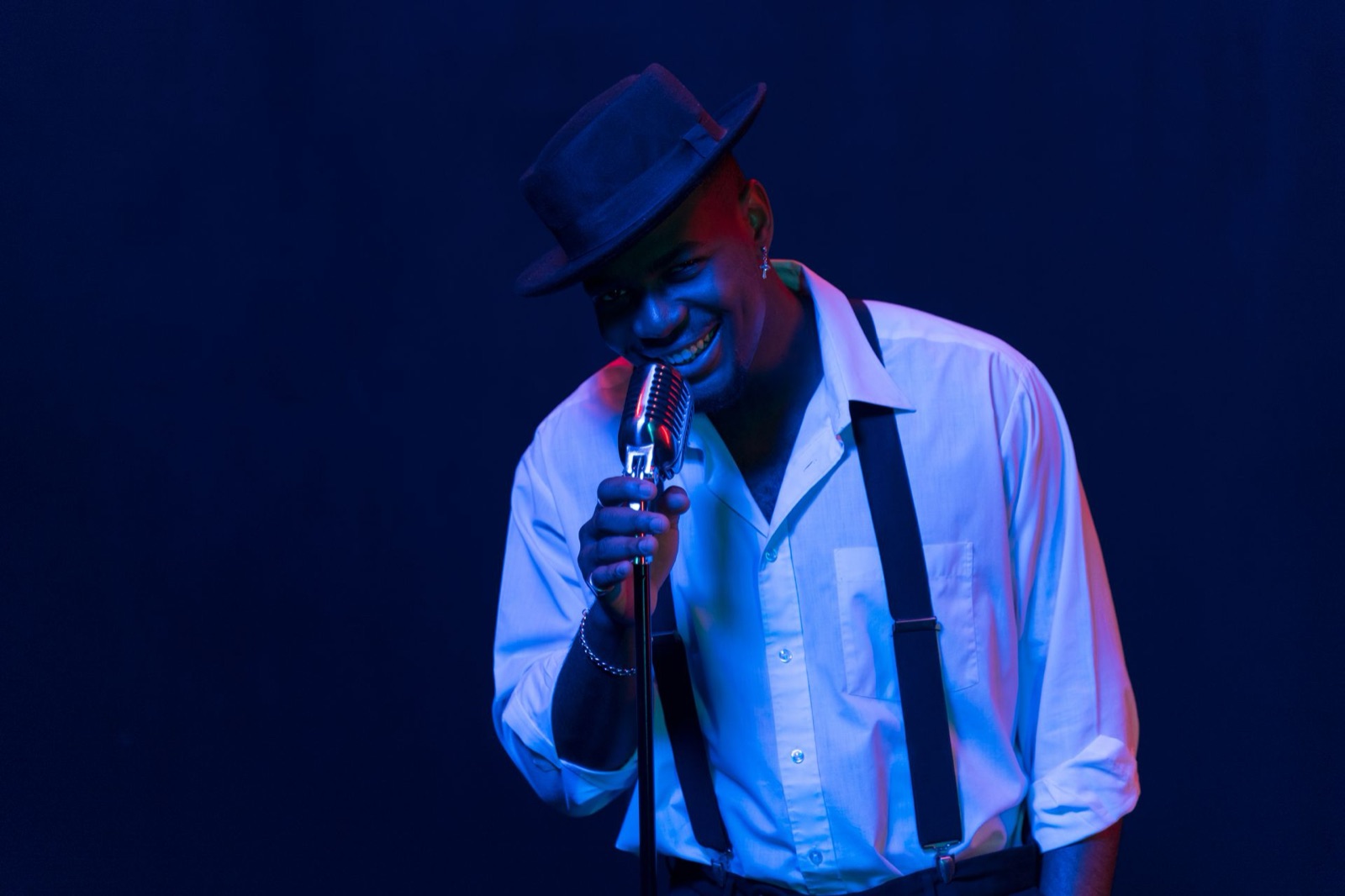
Light separates a performer

Singer in a white shirt and blue stage lighting against a deep dark background

The shirt and face are much lighter than the blue-black stage. That difference pulls attention to the singer and gives their body a clear outline. Blue and warm red light also add colour contrast along the edges.

Read it in layers

  1. Squint until details disappear. Which light and dark masses remain?
  2. Look for the brightest patch. Does it land on the subject or somewhere distracting?
  3. Imagine the stage fully lit. What would the viewer learn, and what would be lost?

Strong contrast does not require crushed shadows. Keep enough detail in the parts needed to understand the action.

Field exercise: make a comparison visible

Choose a scene containing two unlike elements, then make three frames that emphasise a different contrast each time.

  1. Compare subjects. Include both elements and their relationship. It might be one object among many or a small person beside a large structure.
  2. Use light. Move until one element catches light and another falls into shade. Keep important detail in both where needed.
  3. Use colour. Find warm and cool areas or one vivid colour among muted surroundings. Let the chosen colours occupy deliberate parts of the frame.

Bring back: three photographs. For each, finish the sentence “The difference between ___ and ___ makes me notice or think about ___.”

Review your frames

This original lesson develops Chapter 11, “Contrast,” of StudioBinder’s The Elements of Composition: The Complete Guide (printed pp. 68–75). See the composition reading plan.